Make Digital Art - 10 Practical Tips
Recently, my artwork has taken me into the digital realm, and that started way before the global pandemic. Although I will always adore the direct communication with my Unconscious that occurs in my tactile, analog work, I do feel less restricted digitally in a lot of ways. There’s so many beautiful digital effects that I love to explore. I love that I get to be really specific about my colors, work in layers, duplicate objects… the list goes on. You can see some variations of all that I’m talking about in my work here. So if you want to try making a digital art piece out of different images, here are my 10 practical tips.
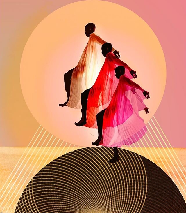
‘Reachin’ Round’ collage, which includes some fun effects that I can only do digitally like transparency. For more work like this, check out my Instagram page or Website gallery.
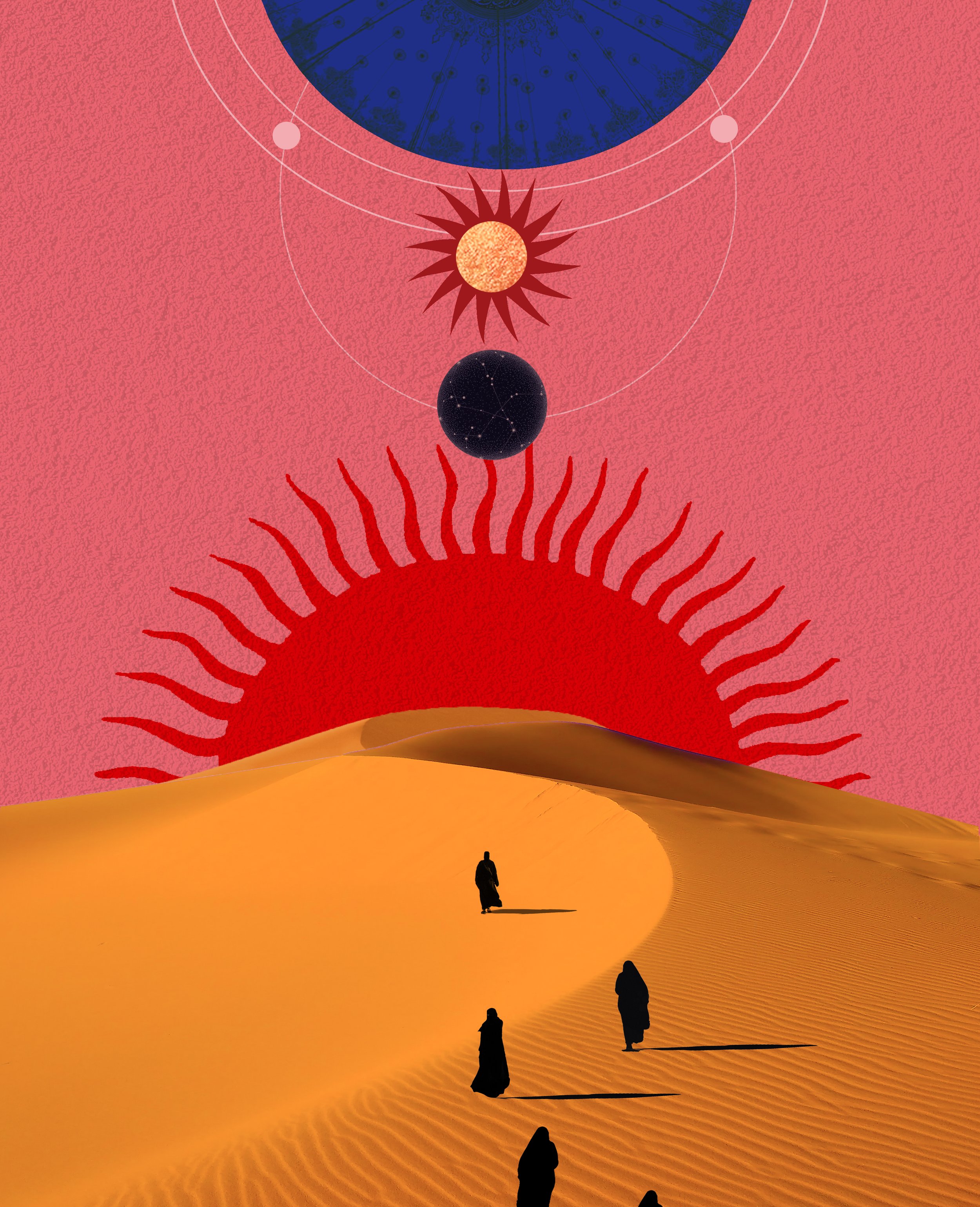
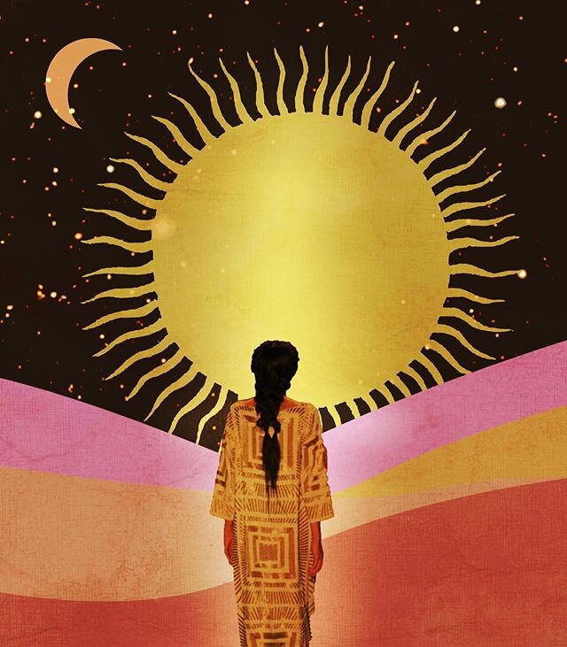
‘Sun creatures’ collage. For more work like this, check out my Instagram page or Website gallery.
1. Build a photo library and get inspired
Start by gathering your digital materials. The possibilities are truly endless! You don’t have to be a pro photographer to start collecting some shots. Even non-polished phone images that have some kind of interesting element are great. Pexels.com and Unsplash.com are some of the free resources for stock imagery I utilize, but there’s many others. Snap some photos of what you can find and add it to your library. Add textures that you could overlay something with!
There are many ways to not straight away go online to search, but of course you can. If you are just doing this for fun, you have the whole web to play with. If you’re a professional artist, then read up on your copyright rules and make use of images that you can license. Something I often do is play with watermarked images in a collage before I then decide to buy it to be sure I actually need it. You can also reach out to photographers that you want to collaborate with. The web is your oyster!
There are so many beautiful images out there that you can also just get inspired by. I’ll often find interesting color hues or combinations online that I absorb into my personal work.
TOP TIP: you don’t want to spend all day looking for images and get lost scrolling, draining your creativity. Give yourself a cutoff point. Sometimes more is less – see what you can do with what you already have.
You can always come back to collecting once you have a bit of a framework and are clearer of what you’re looking for. Sometimes I’ll get really specific. A recent example of this was the google search for a ‘gold glass sphere’ that I ended up using.
Don’t get lost in a certain look of an image or attached to a composition. Digital collaging means creating something new out of many old things – so get creative and don’t be afraid to take something apart that exists. That’s the whole point. Reference, alter, create and enhance, don’t steal.

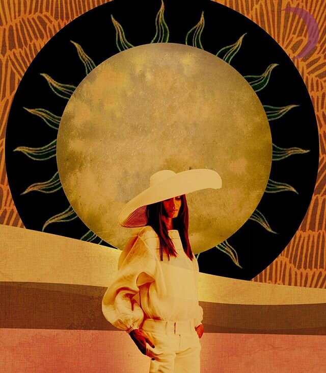
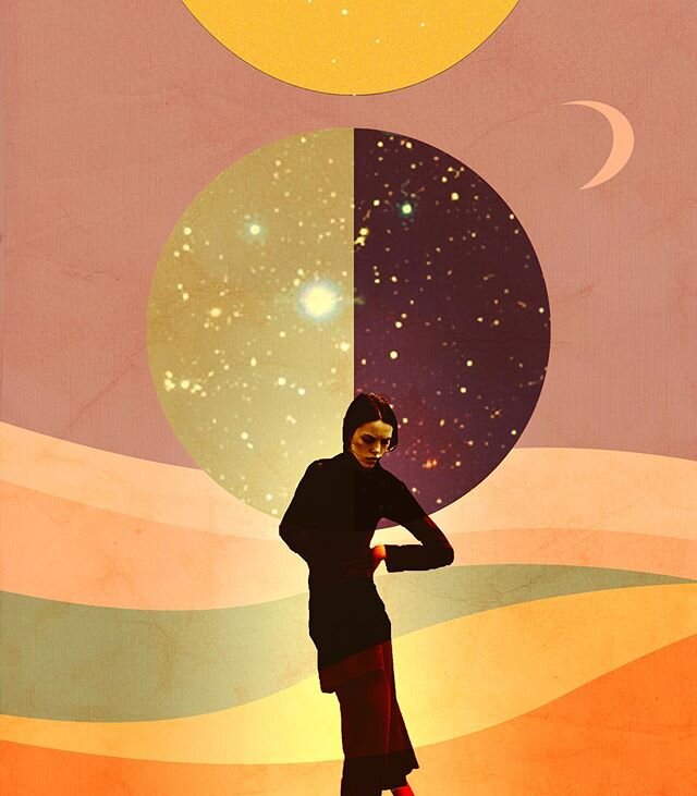
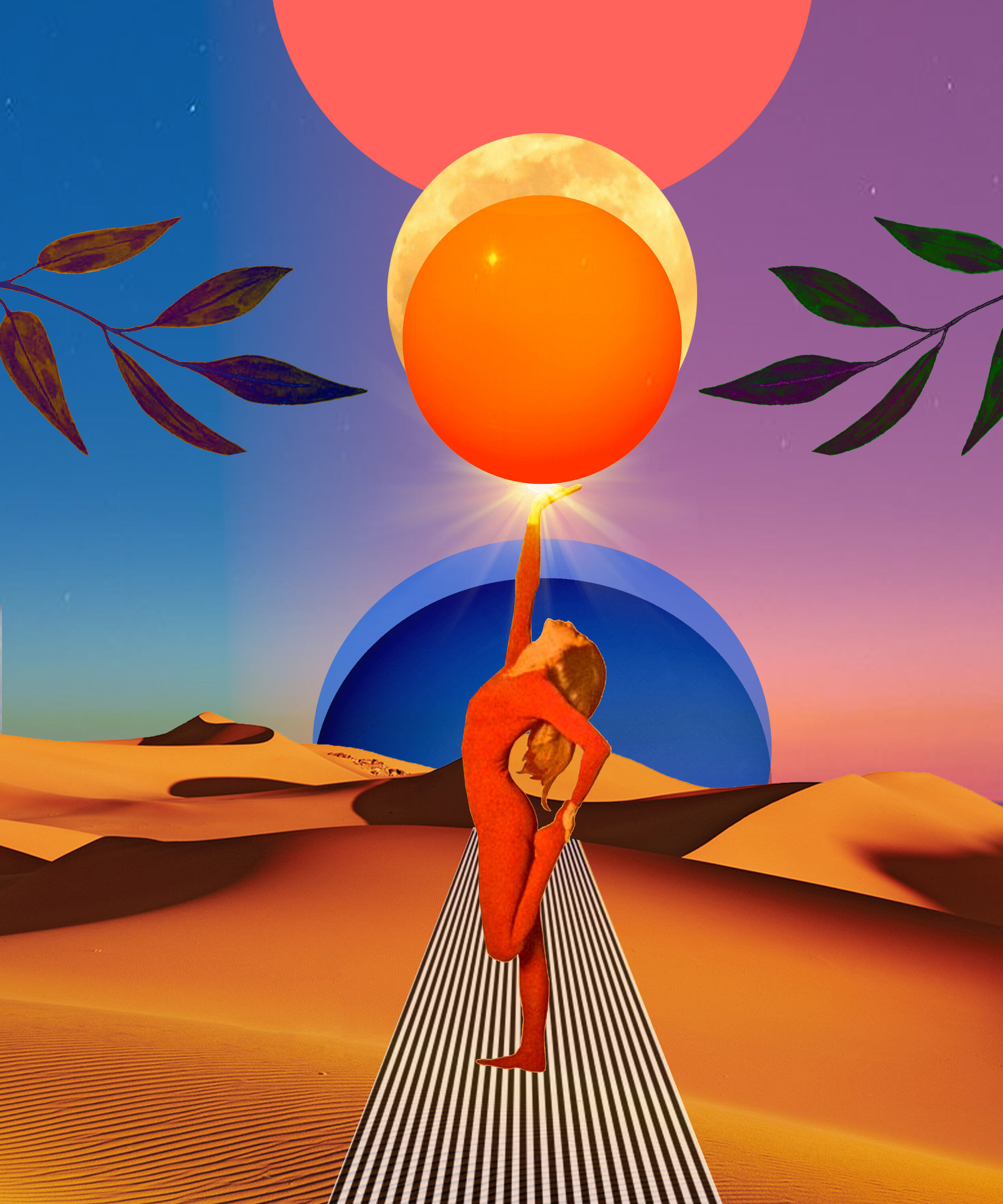
Note my consistent reuse of oranges and softly shaded lighting. Collage ‘Behind the Face.’
2. Keep your color palette consistent
I usually try to match my saturation degrees, which I often prepare before I even start my piece. There’s no scientific ways to do this. I have a really colorful style so I like to use intense saturation that I will sometimes enhance digitally lat. But you can prepare for it before you even start by making a library of photos with colors you would like to match and use that as a sort of materials color palette. You can also use a color picker tool to save swatches that you’d like to use (more on this tool when we’ll talk Photoshop later). Pinterest can be nice to make mood boards for color use.
In general, my best tip is to repeat colors. I would say it’s always a good idea to reiterate colors in the fore- and background so that the overall image connects with color and has a cohesive feel.
3. Keep your lighting consistent
Keeping my lighting consistent is a rule I’m pretty strict about. This also starts before I even make a file. The reason is that lighting can get really messy in the digital art world. You may cut out a figure that has tons of shadows (hard light) and then find a really softly lit ground for her. That will make the whole piece seem less realistic / tied together. So try to pick lighting that matches: either have most of your objects be softly lit (not too many shadows or harsh lines) or choose the opposite.

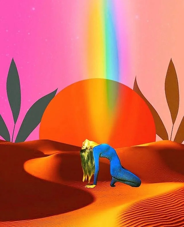
This piece, ‘Sun and Rising’ is a combo of Photoshop and Illustrator. For more work like this, check out my Instagram page or Website gallery.
4. Pick your Program
Once you have gathered your materials, color and lighting pallets, it’s time to select your program. My program of choice is Photoshop. I know I know, it’s not free. To me, it is absolutely essential to what I do so I’d happily pay for it monthly. You could always do a 30 day free trial. There are many other programs out there for image manipulation, but real talk: Photoshop is #1 (wanna sponsor me, Adobe?). To me, it’s worth figuring out.
Photoshop is very versatile, but where it reaches its limits, I bring in Illustrator. I’m well aware that Photoshop can be very intimidating when you start. It was for me. But just start playing with it and take the fear out of it. Practice makes perfect. I am pretty sure the way I do things on Photoshop isn’t the only/recommended/most efficient way. So what? Everyone learns their own methods while trying things out.
Note: I could easily turn this post into a Photoshop tutorial. That would be never-ending as the program is so complex. I’ll share my favorite tools and set ups along the way, but most things you can easily google on how to do. There are amazing resources out there for you.
5. Set up your dimensions and dpi
Your canvas can be any size but be careful. If you’re using low resolution images in your library, you might want to make the overall dimensions of your piece smaller. I probably wouldn’t go much smaller than 10 inches height though, otherwise your image will pixelate easily. You always have the option to modify your size later, but making it bigger after the fact, you will loose quality. I also always set the image resolution to 300dpi for best quality. Here in images:

On Photoshop, go to File…New… in the top bar

Select your settings or a preset.

Here is an excerpt of what my workspace usually looks like.
6. Play play play with your program
Any computer program takes time to master but the most important thing is that you start to familiarize yourself with the software and get curious about the tools available. Cut things, move them around with the selection tool, and layer them. Just figure out what processes work for you in Photoshop. It will take a while to figure out — don’t get discouraged.
Blending mode drop down menu on layers panel (set onto Normal here)
7. Make layers your bffs
Start the collage by importing your images onto layers. You will definitely come to work with layers in Photoshop: they are probably the most important concept to understand about the program altogether. Again, there are wonderful resources out there explaining layers and basic compositing. I will link one below by Adobe itself.
My most important takeaway from layers are: Use only one subject, shape or image per layer. This will make your life so much easier when wanting to get rid of something in your collage, play with settings/shading etc. for one particular piece of your work, or simply moving something into the foreground (you can simply drag the layers up to come to the foreground of the one above it.) One simple tool that I often use with layers is the Blending Tool that will appear as a drop down menu on top of the layers panel. It makes for super interesting shading and effects. Give that a try.
8. Make a background and learn to love gradients
I often start my composition by making a simple background. I personally don’t like staring at a white canvas, I’d much rather edit/ cut / combine my images in front of color, and I will often end up using the background I made initially in the finished collage. I like to have gradients of usually two colors here. Let me show you how I do it:
You’ll pick two colors that you want to blend. At the bottom of your Photoshop toolbar there are two color swatches. When you click directly on the first one, you can pick a color from the spectrum. You can also hover the Color Picker tool over any color on imported photoshop images, to get that color as your swatch. To flip between the two and find your second color, simply use the little arrow next to the swatches .
Next, select the gradient tool on the toolbar. In the top bar on Photoshop, click on the color display gradient to get into the Gradient Editor. Here you can play around with different gradient uses of your own or preset colors.


Swatches (all the way at the bottom of the toolbar for me — see left). Use the arrow to switch between swatches.

Color picker tool. To find any color in an existing image in photoshop

Next, I will select the gradient tool on my tool bar.

This or some kind of form of this Gradient editor tool will appear in your top bar. Click directly on it.

Gradient Editor to pick your gradient of choice.
Next, make and select a new layer. If the Gradient tool stays selected, you can now do the following: A little cross hover will appear on your canvas. Now you can click it and you’ll see a line appear when you keep holding the mouse and drag it across your canvas. Create some distance between your click point (let’s call it point A) and the the release of the click point (Point B). Once you release, you’re gradient will appear. I will often do my Points A and B outside of the canvas so the background is bigger than just canvas size just in case.


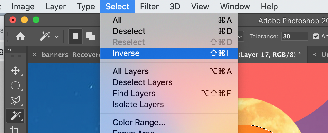
Select inverse: option to reverse your selection.
9. Figure out your digital scissors and get cuttin’
Once you have your background, you can add on layers of images and begin to cut them and arrange everything together. I’ll show you some of my favorite cutting tools here that you can always watch tutorials on them. One thing that I use all day long is the select inverse command on photoshop. It will inverse the selection: So if I select my main subject and inverse it and then press delete, all but the subject will be deleted.

Markee tool. Select an either elliptical or rectangular area and click delete.

Quick selection tool. Simply select the area you want to delete.

Magic wand tool. Select areas of the same color or color family.

Trace shapes and press delete to cut. You can also use the magnetic or freehand lassos.

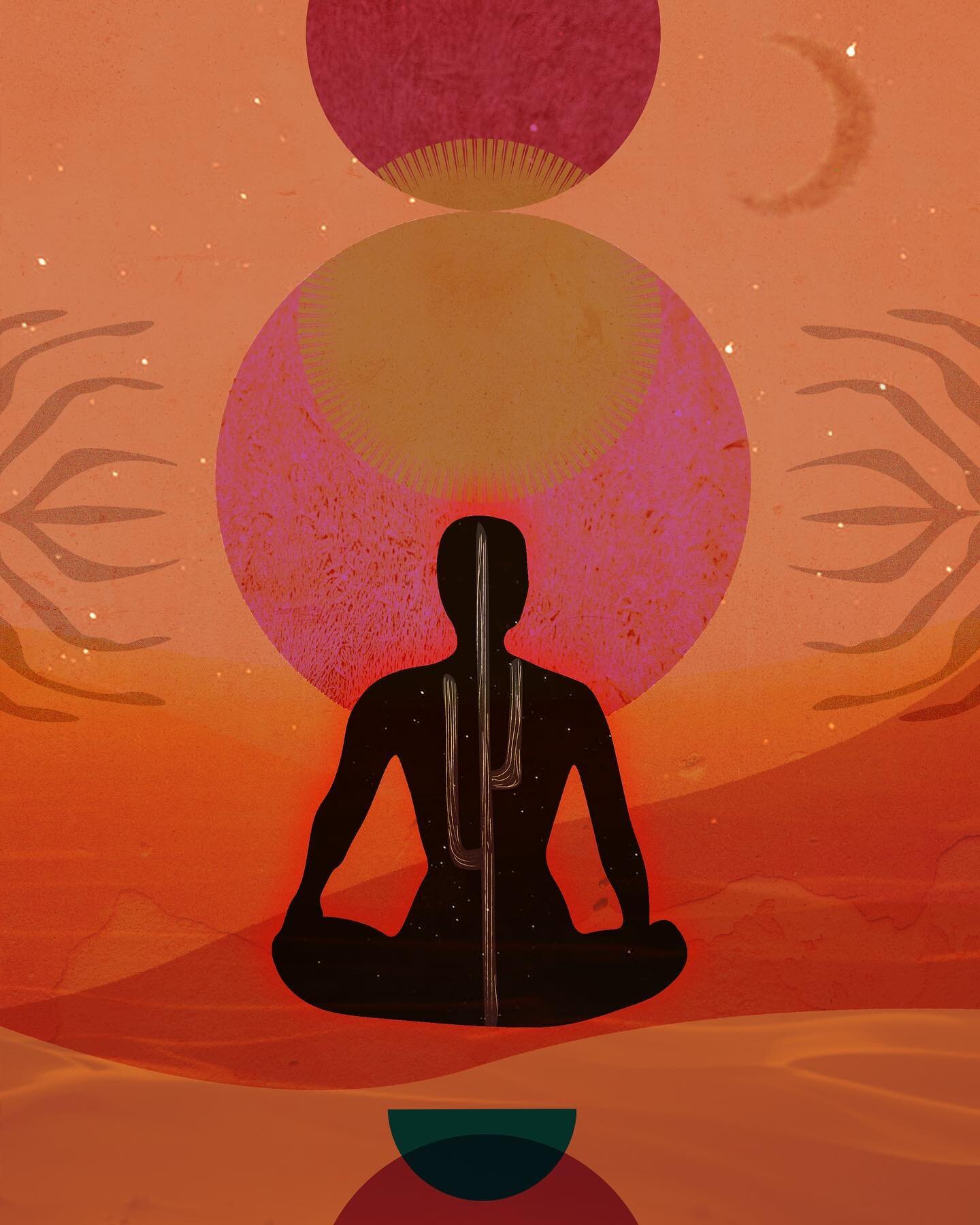
‘Spherical Being’ collage.
10. Keep your composition principles but remember why you went digital
Sometimes, with the overwhelm of the digital aspect of creating, people forget basic concepts of composition that they’d intuitively go to in analog work. In post ‘Make a collage - 10 practical tips’, I mention a lot of tips for composition if you want to check back in with that once in a while.
Do also recall why you wanted to work digitally – so actually make use of the fun new tools available to you in this space. You simply can’t make an object double or transparent when you work analog, so that stuff is what it’s all about.
Just have fun with all of this. Give yourself space and time to explore. Allow yourself not to have to be perfect at something you are just figuring out. I hope these tips were helpful. Let me know if you have any questions and link up with me. I’ll leave my instagram down here – feel free to send me a DM.
x Nat